Fall One Room Challenge: Week One

I am so honored to be a part of the One Room Challenge this fall. Last time I took part in the challenge I completely remodeled my Living Room/ Dining Room area. I have to say, it is my most favorite room in the house! Just to jog your memory, here it is!

Needless to say I absolutely love color and since this is my house, there will plenty of it to go around. This challenge, I decided to redo my entryway off of this room. It really just doesn’t compare and since you can see them at the same time, the entryway definitely could use a little love.

When we purchased the house, every room had to be gutted and redone. The architecture was dated, the finishes were dated and obviously the floor was dated. Here is what we had to work with when we first moved in about a year ago.

Ah, yes, just look at that arched mirror on the left. I am pretty sure this is not what our guests want to see as they enter my home. There are too many things going wrong here, I just had to start from scratch LOL!

The room to the right is my Living Room/ Dining Room the room pictured above from my first ORC. Obviously these pictures are older but I wanted you to see a true before of how far this room will come by the end of the challenge. What could I possibly do with this terrible space?? What on earth have I gotten myself into? Well, I guess you will just have to follow along to find out! I promise you will not be disappointed.

XO,

Please make sure to follow along with all my fellow challengers to see all the good design that is to come from this fun challenge!

At Home with Ashley | Bre Purposed | Dabito | The English Room | Erin Kestenbaum

Harlow & Thistle | House of Brinson | J & J Design | Kelly Golightly | Linda Holt

Megan Bachmann | Michelle Gage | Mimosa Lane | Murphy Deesign | Vestige Home

Old Home Love | SG Style | Shay Geyer | Sita Montgomery | SMP Living

Media Partner Better Homes & Gardens | TM by ORC

One Room Challenge: Week 2

This project was created in a partnership with the One Room Challenge Sponsors!  

All ideas and opinions are my own!

Really?! How is it week 2 already? So much to do, so little time! I am feeling good though so far, one thing I know for sure is that everything takes longer than you think it will!! First thing is first, we had to demo the space, and by that I mean remove the existing nasty carpet, take down the short doors, and get rid of those hideous rounded columns. Oh, and don’t forget that awful tile YIKES!!!

Here is a picture after we finished the demolition. Look how open the room is now! Isn’t that crazy?

 One Room Challenge Week 2 Progress

The demo took about a day, then we had to pour the concrete for the steps that were missing where we ripped out the columns. I don’t know about you, but I love to tear out old and dated architectural elements.

After we filled in the steps we built out smaller square columns since we still had to hid a bit of duct work in the right column. We had a little re-wiring to do as well.

Next up was raising the header height on the doors. I love to do this any chance I get in a room. The taller doors bring your eye up and really make the room feel more grand. It can actually be a fairly easy thing to do, as long as the door way isn’t structural like mine is. As long as your ceiling is 9′ or taller, you can definitely fit in an 8′ door.

Raising Header Height on Doorway

I selected these gorgeous doors from Metrie’s Fashion Forward collection. I dreamt that one day I would have doors this beautiful in my home, thanks to the One Room Challenge, my dreams are coming true. Do you know what the best part is? They lead right into my home office so I will see these beauties everyday! I will be finishing them off with some gorgeous Emtek brass hexagon door knobs, they are like jewelry to the perfect dress!


Metrie Fashion Forward Doors

Photo credit: Metrie.com

It is not a secret that we love moulding over here at J&J! Working with Metrie, whom has such gorgeous door and moulding selections was so much fun. I wanted to create a “shiplap” look but with a twist. I found a baseboard that had an interesting profile and stacked it on top of each other to create this cool detail on the walls. We also cased out the windows with a more simple moulding to offset the wall detail. Here is a sneak peek of what we have so far. Once we caulk and paint, it’s going to be BANANAS!!!!!!

One Room Challenge| Metrie wall Detail | J&J Design Group

Let’s dig in a little bit and see what I am going to be doing with furniture in this fine One Room Challenge shall we? Like I mentioned in my Week 1 post, I like to design with a neutral back drop and pop in color. Here is a teaser with a few of the products I am using in my room. Let me know what you think!!

J&J Design Group | One Room Challenge Week 2

Sources:

1 Navy Velvet Chair : All Modern | 2 Lucite Coffee Table: Lamps Plus | 3 Chandelier: Crystorama |

4 Custom Pink Pillow| 5 Brushed Brass Knobs: Emtek | 6 French Doors: Metrie |7 Artwork: Parima Studio

 Can you feel it? Feel it starting to come together…… Oh my, I am so excited!!

Don’t forget to follow along with my fellow challengers below!

XO,

Centsational Girl | Chris Loves Julia | Christine Dovey | Dwell With Dignity | The English Room

Glitter Guide | House of Brinson | House Updated  | J+J Design Group | Lark & Linen | Abby Manchesky

Nesting Place | Old Brand New | Old Home Love | The Pink Pagoda | Rambling Renovators

Erica Reitman | Sketch 42 | Suburban B’s | Erin Williamson  Media Partner House Beautiful | TM by CIH

One Room Challenge: Week One

Having the opportunity to participate in the One Room Challenge is a dream come true for me! I have followed along on past challenges and love to see the rooms transpire. Being an interior designer, and designing rooms for my clients everyday is definitely rewarding, I get so wrapped up in my client’s homes that my home usually takes a back seat. I designed my current home that I am living in about 9 years ago, I was only a few years fresh out of design school, so let’s just say my tastes have changed just a bit. There were so many things I wanted to redo, new products came out and well, I just have so much more experience under my belt.

If you are new to the one room challenge, welcome! The One Room Challenge is a bi-yearly event where 20 designers and bloggers participate in a challenge to transform a room in their home. It is so much fun to see the progress of each room during the 6 week time frame.

My husband and I had a tough decision, build a new house, buy an existing home and remodel or remodel our existing home?? My husband refused to remodel a home we have already remodeled, building a new home had too many restrictions on what was available to choose from so we naturally took the toughest choice; buy an existing home and remodel it completely.

We found this beautifully dated (like the 90’s called and wanted their house back) property that had a great lot for my kids and a 4 car garage for all of our junk!! The floor plan works great for our family and we don’t have any wasted space like we do in our current home. Needless to say, the One Room Challenge couldn’t have come at a more perfect time for me!

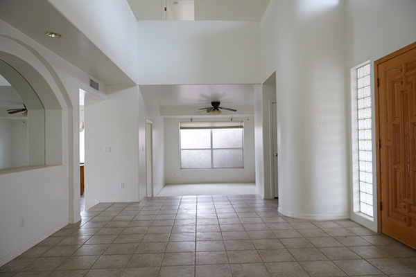
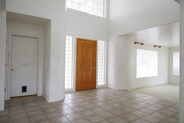
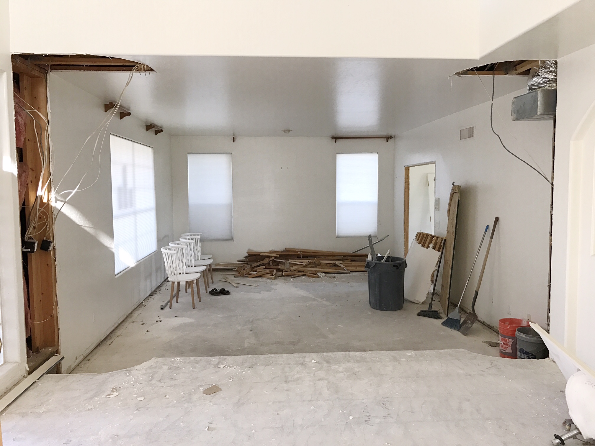
I have decided to transform my living/ dining room for the challenge this season. I am so tired of my existing dining furniture, it was a wedding present and let’s just say we are celebrating our 10 year anniversary this year. The great thing about our new Living / Dining space is that it gets great natural light during the day. So here she is, in all her glory and it hasn’t been touched a bit since about 1992 that is!

Let’s have a little chat about all her problems shall we?

Rounded Columns: These columns are huge and block your view into the space. They have a undesirable 2″ moulding as does the rest of the room and a rather unattractive wall texture. So see ya later!!!

12″ Square Tile: I almost always steer clear of 12″ square tiles. I just feel that not only to they date the space, but they give a busy grid pattern that I don’t really care for.

Paper Shades: Let’s be honest, these just look cheap. I know they can serve a utilitarian purpose but they are not designer friendly, at least not for this designer:)

Eyeball Can light: This seems to be the only light available in this room at the moment, it gives a dark alley sort of feel at night that can be a little scary. You can point it anywhere you please, haha!

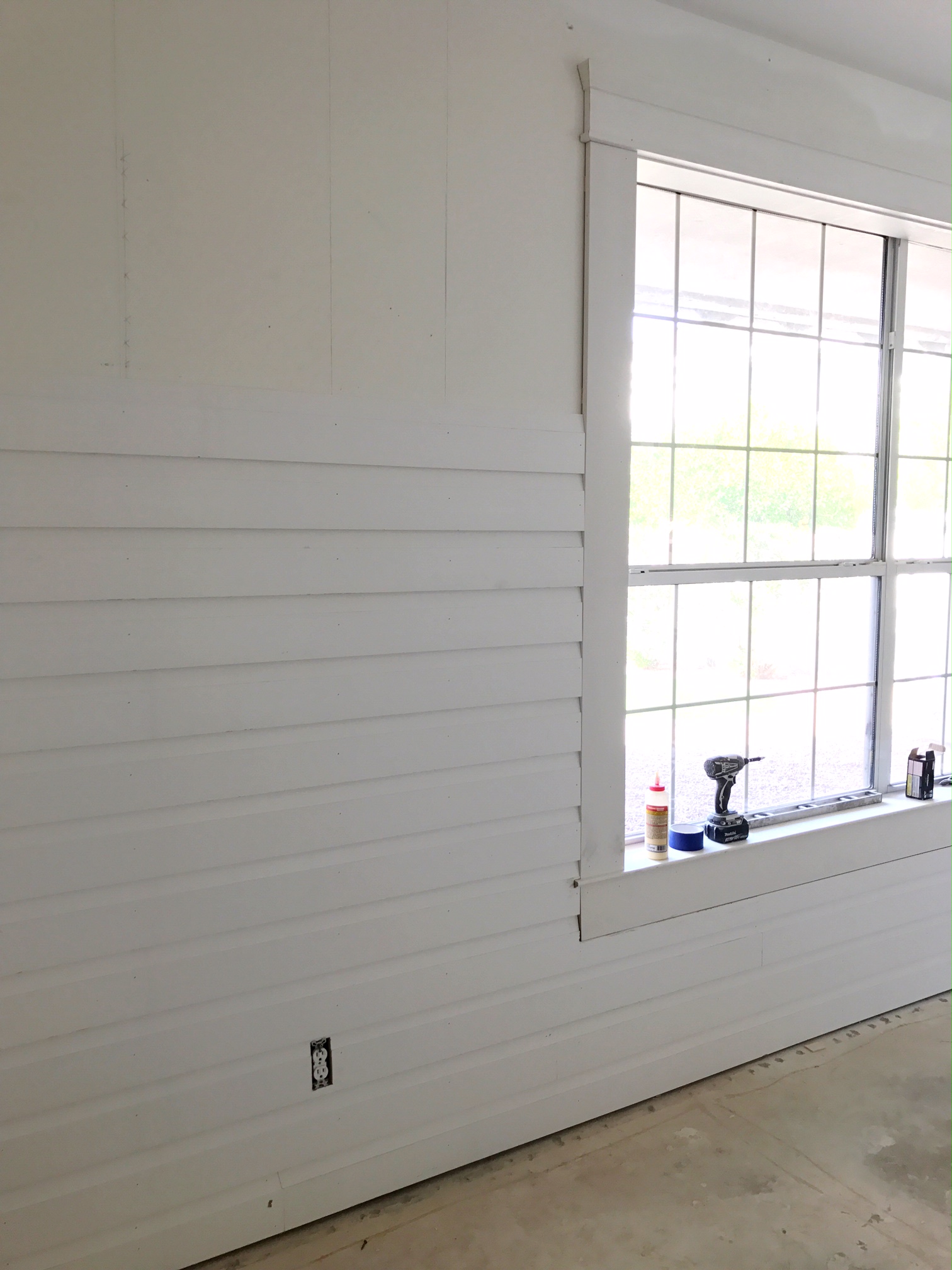
Short French Doors: I don’t mind the look of these doors, but they are very short and make the room feel squatty. I may be able to re-purpose them in another area in the house with lower ceilings.

Moldy Carpet: Water damage is apparent in the corner of the room. We think the washer may have leaked in a couple rooms over and pooled in the corner of this room. Needless to say, the carpet is history!

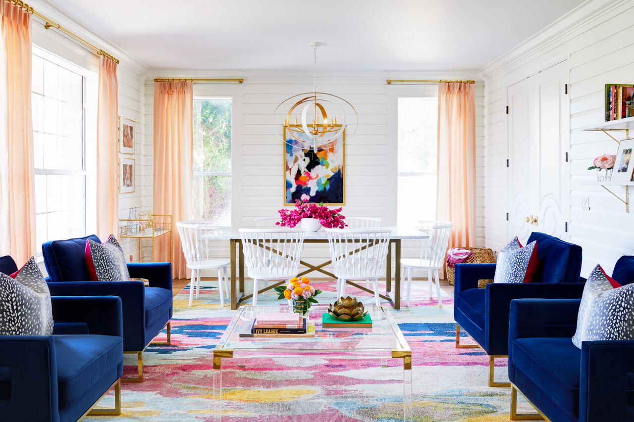
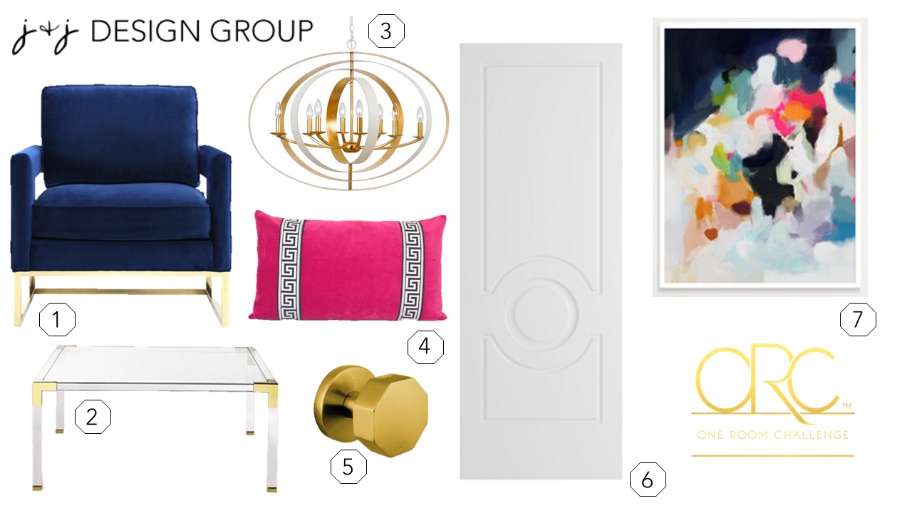
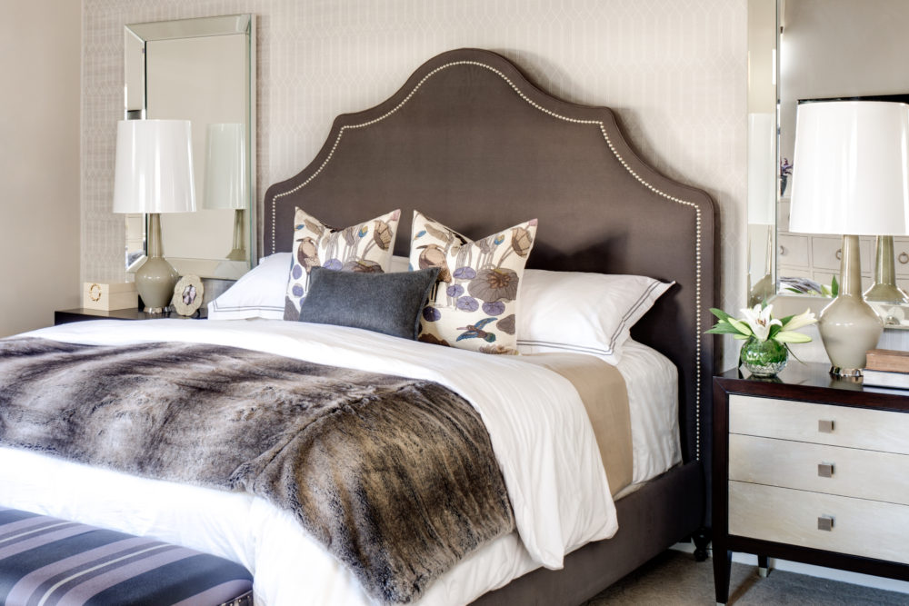
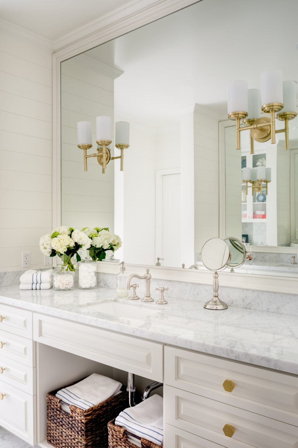
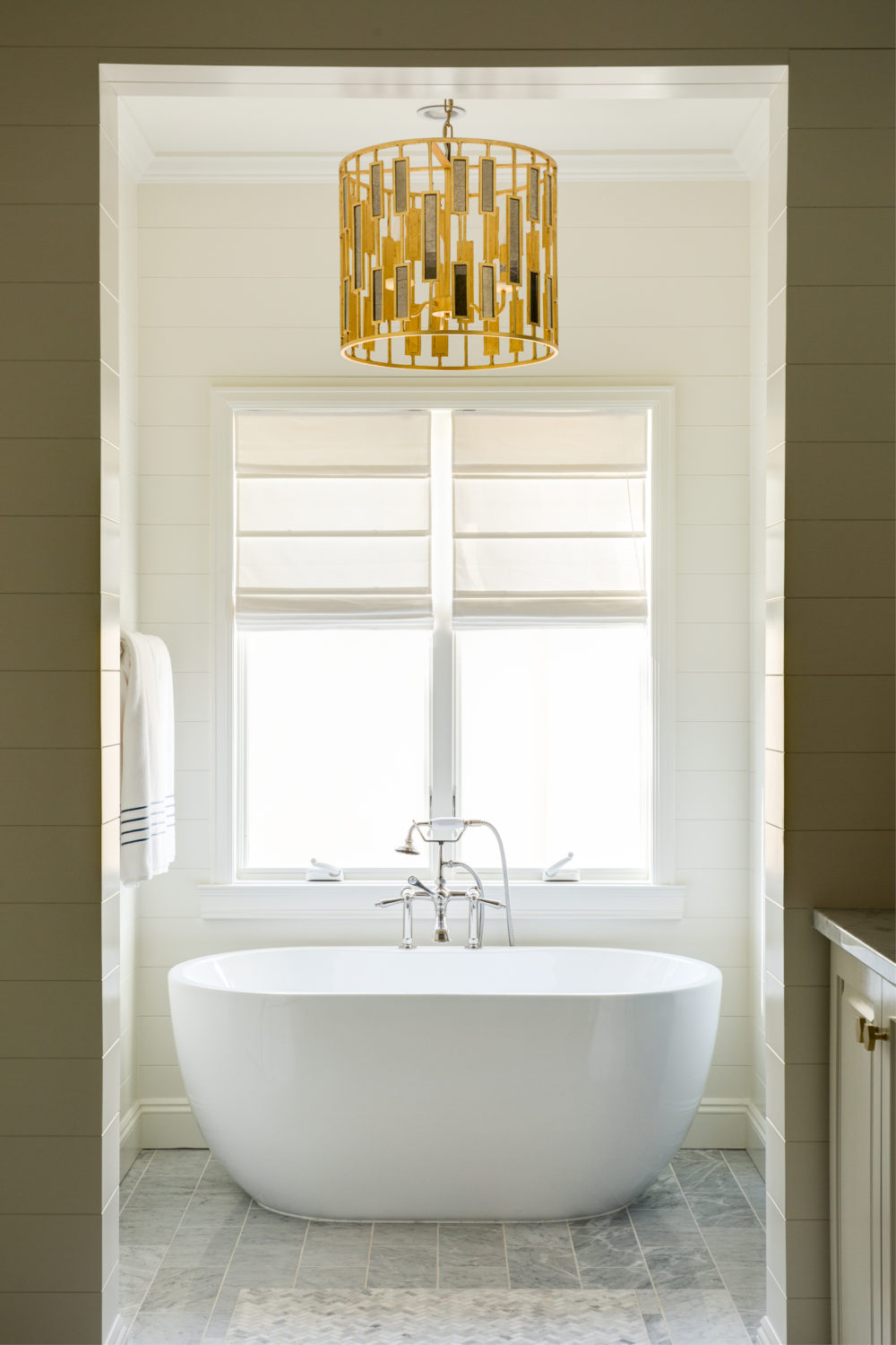
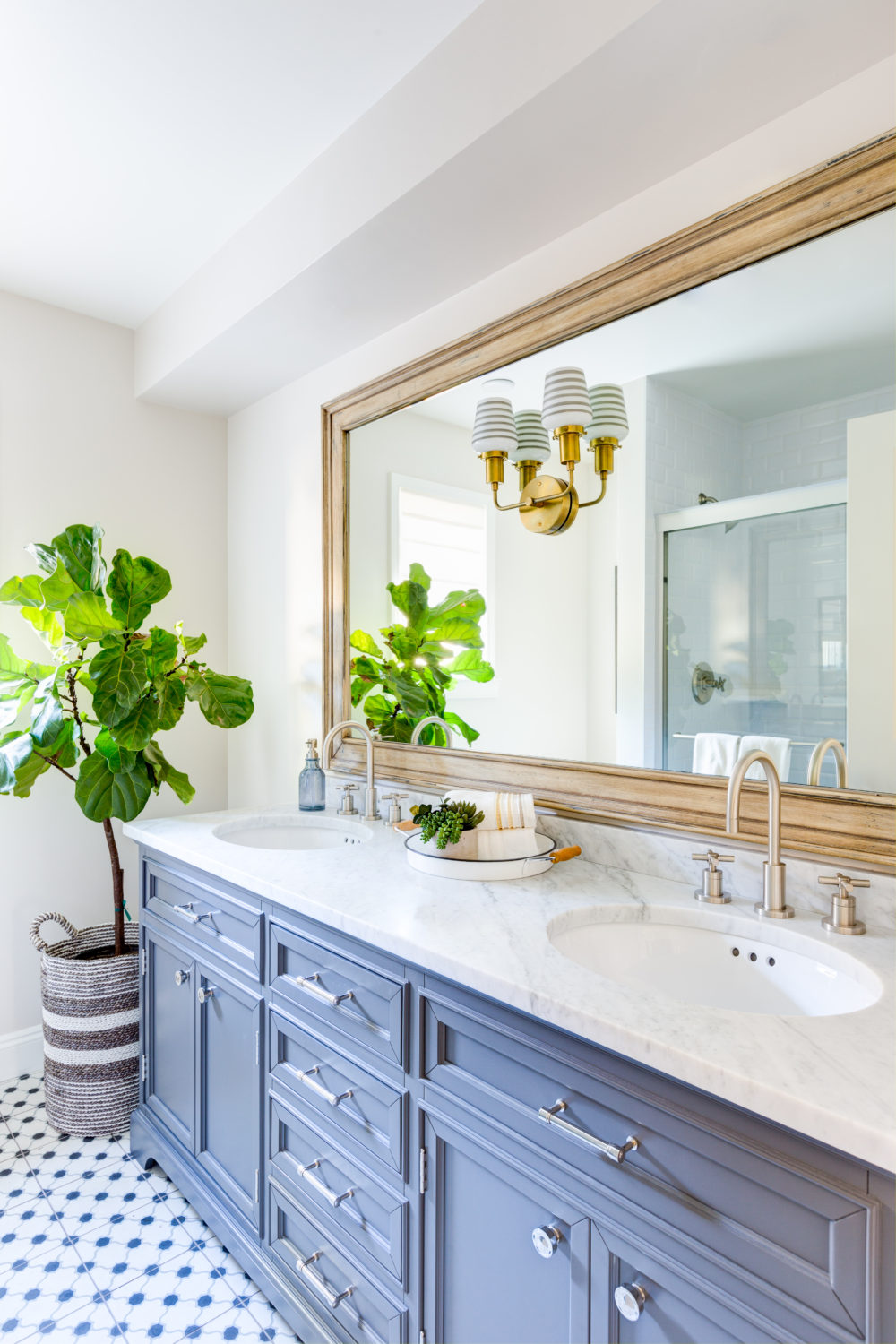
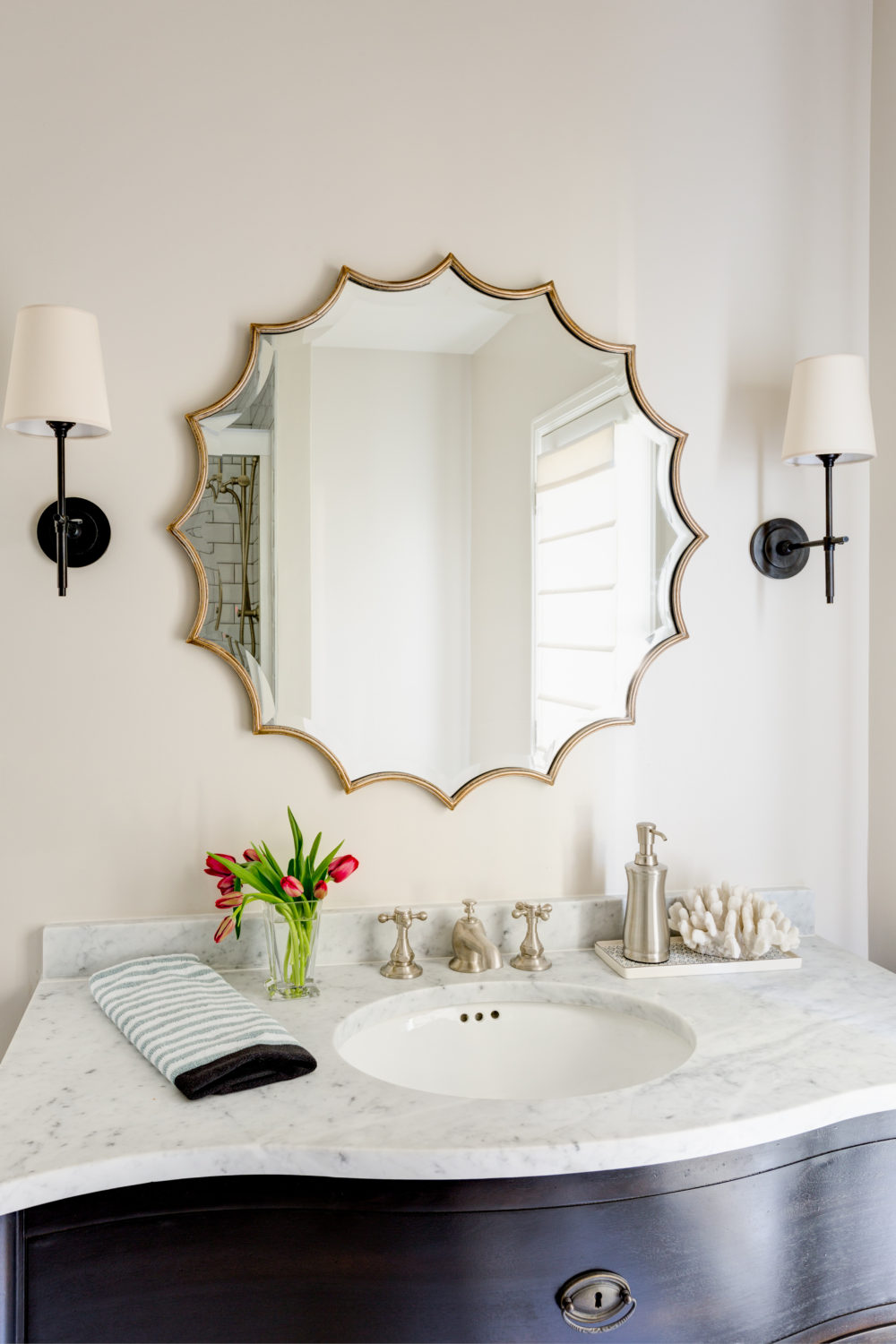
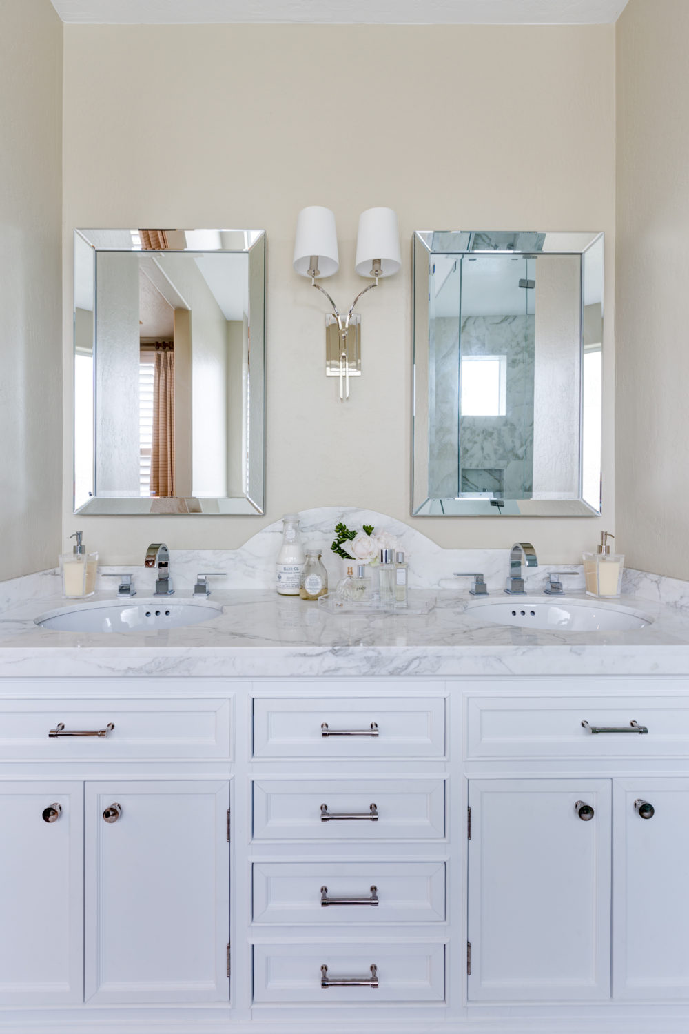
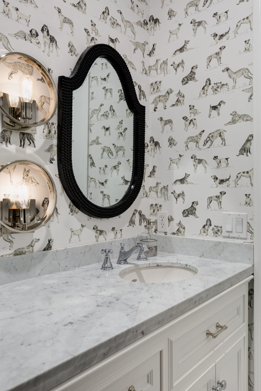
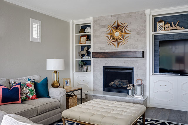
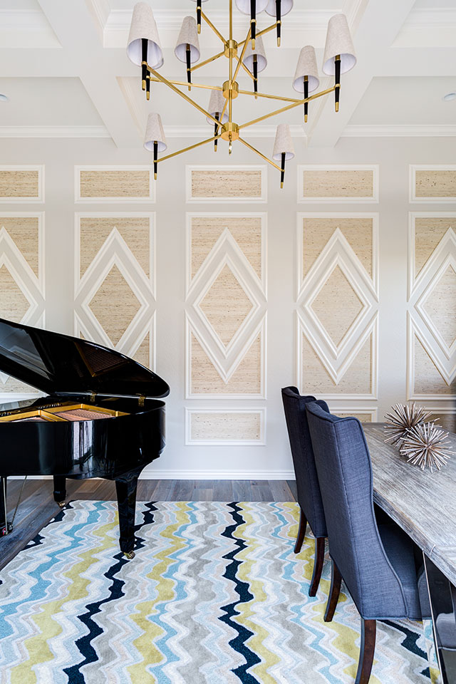
OK, now that your eyes are sore, let’s get to the pretty stuff shall we? I love interior design so much, I live and breathe it everyday. There is inspiration in nature, in experiences and in the people around us. I love to research design trends and get ideas from everywhere. Light and Bright interiors with a pop of color really make my heart sing and that is what I intend to achieve in my One Room Challenge this season. Here are a couple of rooms that I have designed for clients that I particularly love and would like to achieve the same feel in my own home.

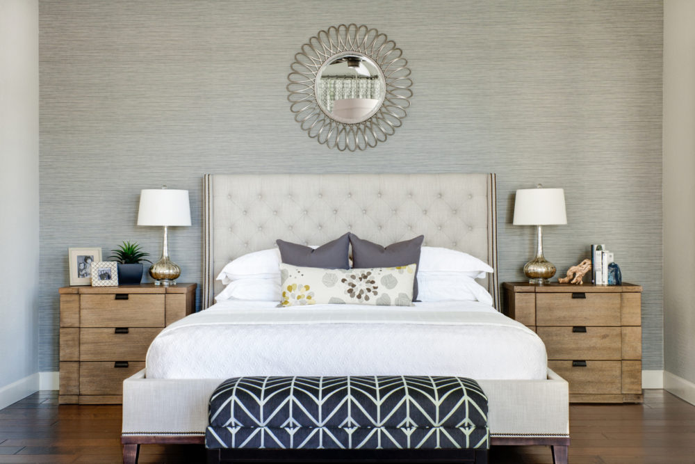
This room is so bright and happy! The coral, emerald green and navy are a few of my favorite colors.

A touch of gold is almost always a must for me as well.

Photo Credit: John Woodcock

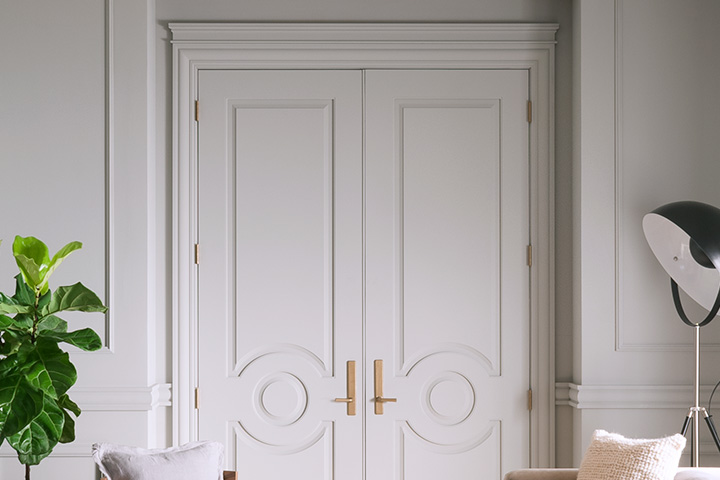
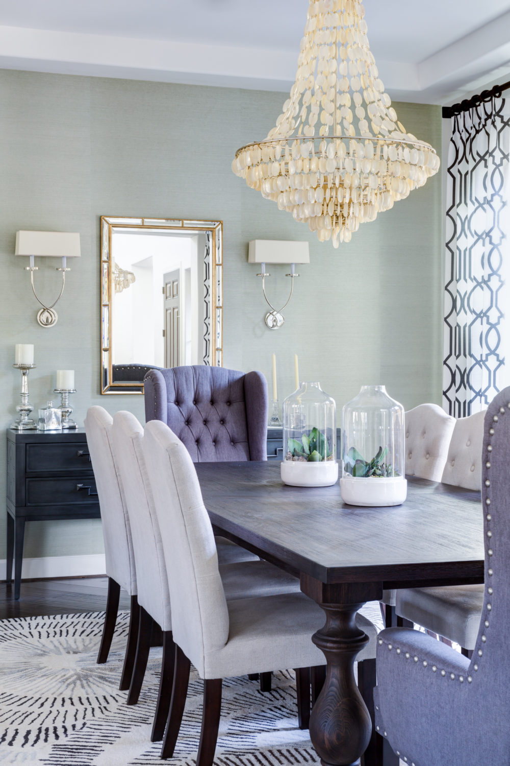
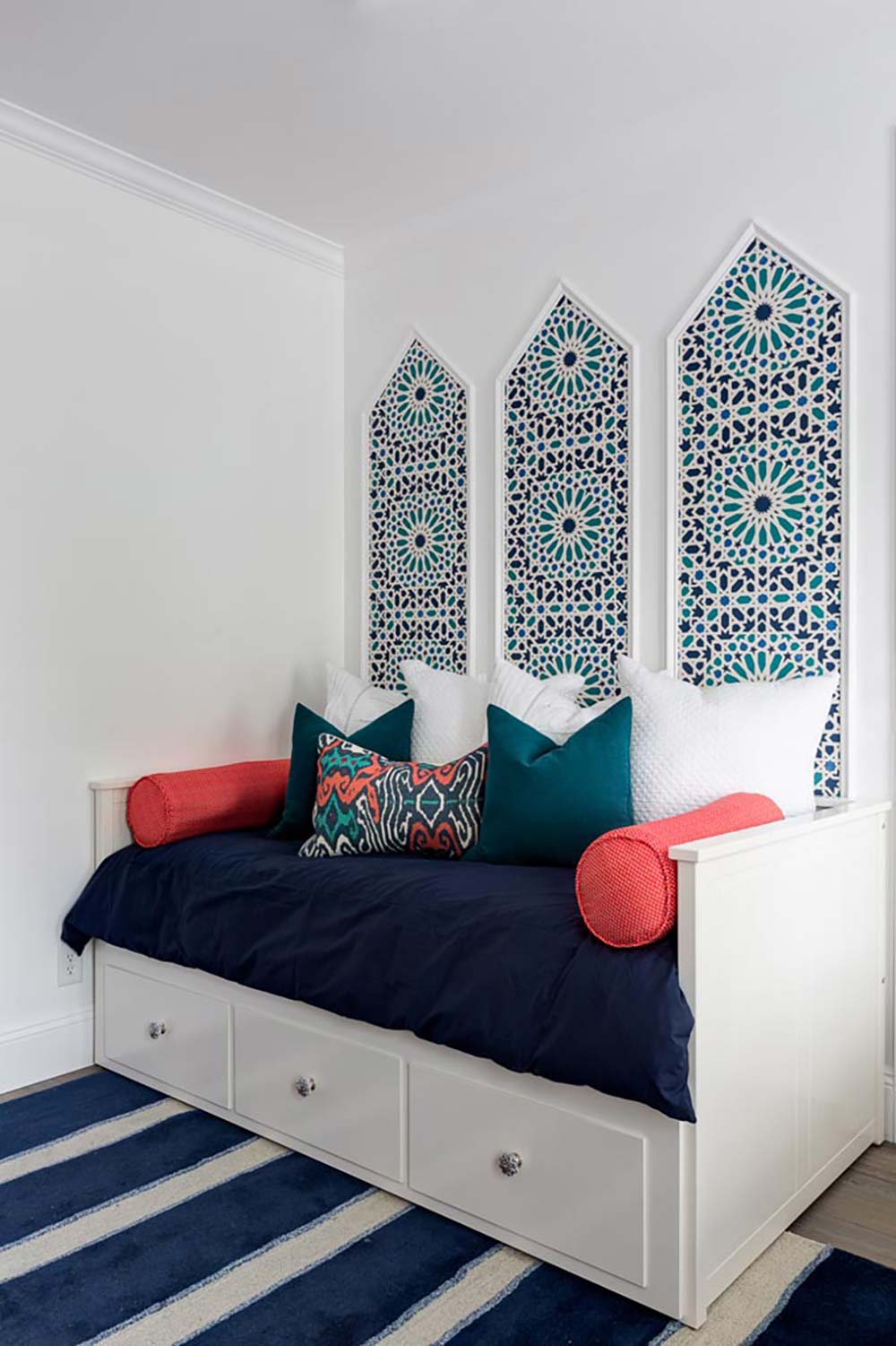
This room may be one of my very favorites! Navy built in, gold hardware, striped drapes, hits of pink,

this is my love language!

Photo Credit: John Woodcock

Make sure to stay tuned as my room makes it’s way into the 20th century. I expect hiccups along the way because no good design doesn’t have them. Tune in next Wednesday to see some demo and plans of what I come up with. Make sure to check out my fellow participants rooms as well (listed below).

XOXO,


Centsational Girl | Chris Loves Julia | Christine Dovey | Dwell With Dignity | The English Room

Glitter Guide | House of Brinson | House Updated  | J+J Design Group | Lark & Linen | Abby Manchesky

Nesting Place | Old Brand New | Old Home Love | The Pink Pagoda | Rambling Renovators

Erica Reitman | Sketch 42 | Suburban B’s | Erin Williamson  Media Partner House Beautiful | TM by CIH


Wallpaper Love.. Our top picks

We have an obsession with wallpaper, not only are they works of art, but they add a lot of charm and character to a room. Check out our top picks for wallpaper these days! It’s not your grandma’s wallpaper anymore!!

This is one of our favorite master bedrooms…The paper gives a visual punch, but it’s subtle.

_48A4556_57_58_60_61_fused-Edit

Photo by John Woodcock

We weren’t looking for subtle here! This mid century dining room dazzles!

Gorlin_Residence--2

Photo by John Woodcock

We chose a sea glass colored grass cloth wallpaper for this dining room. We love the texture it adds to the room.

JandJ_Harrington_7

Photo by John Woodcock

This fun office is full of drama! The vintage inspired bird wallpaper is gorgeous!

JO-OFFICE-FINAL

Photo by John Woodcock

This wallpaper is requested often by our clients. It’s a printed grass cloth, so you don’t have to mess with seams.

Master-JandJ-Cary-Final

Photo by John Woodcock

Architectural details + Fun Wallpaper = YES! We are in love with this guest room!

JandJ_Maxwell_-5

Photo by John Woodcock

XO,

jen post signature


Bathroom Round up….Our favorites!

We love the look of a light and bright bathroom, with charming little details. Jo and I always like to start out with a neutral base and build from there so it’s easy to switch out the colorful stuff when you get tired of it…

Here’s a round up of our favorite bathrooms to date with a few sources to boot!

 This Master Bathroom just sings! We love everything about the brass knobs and sconces. Even though the faucets are stainless, you can still mix in some brass, as long as it’s repeated a few times in the room.

JANDJ_Smith-6

Photo by John Woodcock

Ship lap is our JAM right now! In this bathroom we used 6″ ship lap boards and wrapped it around the entire bathroom.  The gorgeous modern tub is accented by a gold {what else?} chandelier. We found some nice simple towels from Target to keep it light and bright.

JANDJ_Smith-7

Photo by John Woodcock

The shining favorites in this bathroom are the vintage inspired light in natural brass with grey striped bell shades, the charcoal vanity, and the charming cement tiles. We used grey grout with the cement tiles to keep clean up easy.

JANDJ_Smith-1

Photo by John Woodcock

Across from the vanity, we pulled out the existing bathtub and installed a brand new shower. We kept it classic with bright white subway tiles and blue pennies for the floor. We used white grout with the pennies to set off the tiles.

JANDJ_Smith-2

Photo by John Woodcock

The scalloped brass mirror in this guest bath is drool worthy, and we love how it pairs nicely with the charcoal vanity. We used quite a few finishes in there, but it all works together.

JANDJ_Smith-5

Photo by John Woodcock

How about this shaped back splash in this Master Bath? We dressed this bathroom in all chrome and it just shines! The white vanity is full of doors and drawers for a ton of storage.

JandJ_Maxwell_-4

Photo by John Woodcock

This wallpaper is A-Dorable! Especially for the kids of the house, who have a Golden Retriever named Ruby. We paired it with some fun black shaped mirrors and modern light bulb sconces for a look all it’s own.

JandJ_Maxwell_-6

Photo by John Woodcock

We kept the adjoining shower light and bright with subway tiles {have we mentioned how much we LOVE  are OBSESSED with subway tiles?}. They are classic and you can find them pretty inexpensively. Nuf said. How about that grey deco tile? It’s modern and classic all in one! We kept entire floor white penny rounds to make the entire bathroom feel like one big room.

JandJ_Maxwell_-2

Photo by John Woodcock

Hope you have enjoyed a look at our favorites!

XO,

jen post signature


No Fail Neutral Paint colors

I would say the burning design question I almost always get asked by my friends is what color to paint their interior walls.  This can be a very scary thing! Not only is it costly to paint the whole interior of your house, or a ton of work to do it yourself but if you pick the wrong color you could find yourself slapping yourself silly.

Well her I am with a little friendly advice and some colors that are my personal go to and never have me slapping my head!

Let’s just clear one thing up before we get started. Accent paint walls are a thing of the past. Yea, it adds a little color to your house but keep those in kid’s rooms. Pop in the color in your house on smaller items that you can switch out when you get sick of the particular color that you are committing to.

I do love a good accent wallpaper wall however, the pattern is always a nice addition to any space!

Now that we have that out of the way lets talk Color!

Grey can be one of the toughest tones to select. There are cool greys and there are warm greys. Greys that are cool have a blue undertone and greys that are warm have a brown undertone. If you start mixing cool greys and warm greys they can look a little funny with one another.

This house is painted: Dunn Edwards, Muslin. (Below) This is considered a cooler grey and we pulled the cool grey out of the stone of the fireplace and the wood floors we selected.

maxwell-muslin

Another one of our Favorite Grey Paints is: Dunn Edwards, Fine Grain. (Below) This is a warmer neutral and looks good if you have more brown in your flooring.

fishel-fine-grain

When you are looking to go very light on your interior color but don’t want it quite white, our favorite go to neutral for that is Dunn Edwards: Crystal Haze (below). This always makes the space feel light, bright and fresh.

nisser-crystal-haze

It is always a good idea to grab samples and look at them with your flooring, cabinetry and  things that are going to permanently going to stay in your house. We like to use a flat sheen on the ceilings, satin finish on the walls and a semi gloss finish on doors and baseboards.

Maybe, just maybe I have saved you a little heartache when it comes to painting the interior of your house. Remember, keep it neutral and pop in color with pillows, drapes and accessories.

xox,

jo signature 2

Photos by: John Woodcock Photography